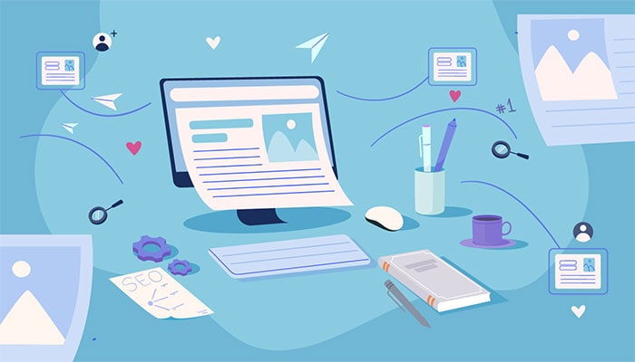
Content Marketing
4 min read
Why Blogging Is Important for Businesses
From increasing website traffic to establishing you as a thought leader, the benefits of blogging are tremendous!
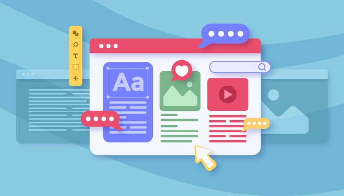
The credibility of your website largely depends on how it looks – and, yes, a poor user experience could cost you potential customers. The functionality and usability of your website are incredibly important, but you can’t let design take a back seat. Your background colors, spacing, and other visual elements all need to work together to become the backdrop of your company’s brand. As we move into a new year, consider these web design tips for 2022 to elevate your site’s look and feel.
Tech trends are constantly changing (which is why our web designers stay so busy). You only have to look at the last few years to see how design elements and website features have evolved. The minimalistic style of today contrasts with the design, text, and feature-ladened websites of the 2000s and 2010s.
Since clear, clean-cut design is king right now, you’ll want to avoid incorporating too many visual elements that compete for attention. Complicated animations and too much copy, texture, colors, and typography make for a busy web page. A true minimalist website strips away anything that would distract from the subject of your website. You can improve your design by finding an integral focus and accentuating that rather than incorporating more features.

Videos are and will continue to be loved by users. But, too many clips can slow your website down tremendously, which is one reason GIFs and other forms of micro-interactions are popular. They may not be able to convey your brand’s story or give step-by-step instructions on how to use your product or service (save those ideas for video), but they can be a highly effective tool for prompting website visitors to take action.
A minimalistic design doesn’t have to be boring. A bright, bold color scheme can make your website stand out without relying on flashy, oversaturated features. Even a single contrast shade into an otherwise monochrome design can have an eye-catching effect. Not all whitespace has to be white!

This technique causes the background to move slower than foreground content, which creates layers and depths within your design and a level of visual hierarchy. As an added bonus, it can also help draw attention to call to action and forms.
It’s not feasible or cost-effective to reinvent the wheel all the time, so you’ll want to create a good design that will last you for a few years. While the trends above are big right now, the following will be relevant and attractive to website visitors for years to come.
For more on the latest trends and help integrating these changes onto your own website, contact the professionals at Front Porch Solutions. We can create highly engaging landing pages, brand assets, and websites that reach your target audience.
Get in touch today with Cleveland’s leading partner for website design, SEO, social media, and so much more!

From increasing website traffic to establishing you as a thought leader, the benefits of blogging are tremendous!
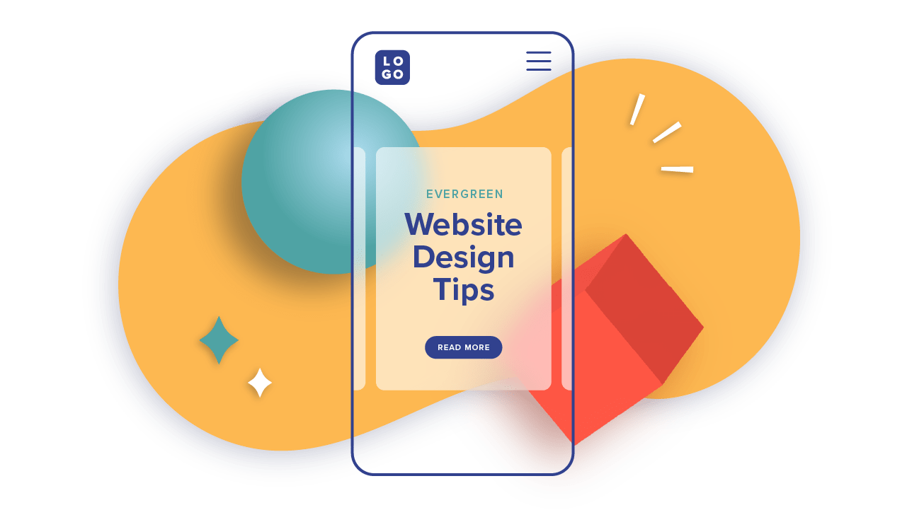
Follow these web design best practices to create an engaging and user-friendly website.

Having a strong business-to-business (B2B) marketing strategy is an important part of determining how you

Fill out the form and we’ll be in touch as soon as possible.